Earlier, I’ve discussed the many choices and complexities involved in choosing a monitor category. Now, I want to go a bit deeper into this by discussing an unexpected surprise I had with a vertically-aligned quantum-dots (VA-QLED) display panel from Samsung.
My significant other recently bought a 60 cm 1080 p 16∶9-aspect-ratio curved Samsung C24FG70 monitor. It’s marketed as a “gaming monitor” with “quantum pixels” (QLED) and 1 ms at 144 MHz refresh-rate.
This all sounds very impressive and above average and all online reviews agreed. The high refresh-rate looks nice in games. However, none of the marketing and even the most in-depth technical third-party online reviews fail to discuss one of these display panel’s main drawbacks.
I need to give a quick refresher in display technology before I proceed. Each individual pixel on a screen usually consists of three colored sub-pixels in red, green, and blue (RGB) colors. A “quantum pixel” or “half-height pixel” splits the three traditional colored area into two smaller areas that together make up one traditional sub-pixel segment. One of these sub-sub-pixels is slightly larger than the other, and it allow for better control of the pixel’s brightness in a given sub-pixel color.
I also need to give you a brief refresher to font anti-aliasing technologies like Windows TrueType. When you read black text on a white background on a display, you’re usually looking at some black letters that appear smoother by making clever use of neighboring pixels’ sub-pixels. The sub-pixel color nearest to a black pixel is called, whatever color it may be, can be dimly lit to help improve the perceived letter rendering.
VA-QLED displays make look good with high-resolutions (e.g. 4 K.) However, the pixel density and quantum pixels used in the Samsung C24HG70 creates an obvious “screen door effect” in the larger 68 cm and 81 cm versions of the panel where you can see individual pixels even at a normal viewing distance. A shout out to the IGN review for noticing this problem.
This isn’t super-appealing but you won’t really notice it on the 60 cm model unless you stare at large areas of solid color all day. The real problem with this VA-QLED panel is that regular text looks truly awful. Modern web design trends tend to lean towards slightly grayer text, which the unusual quantum-sub-pixels produces by turning off half of the whole pixel. This leaves visible white lines striking through the text since every other row of quantum pixels are turned halfway off.
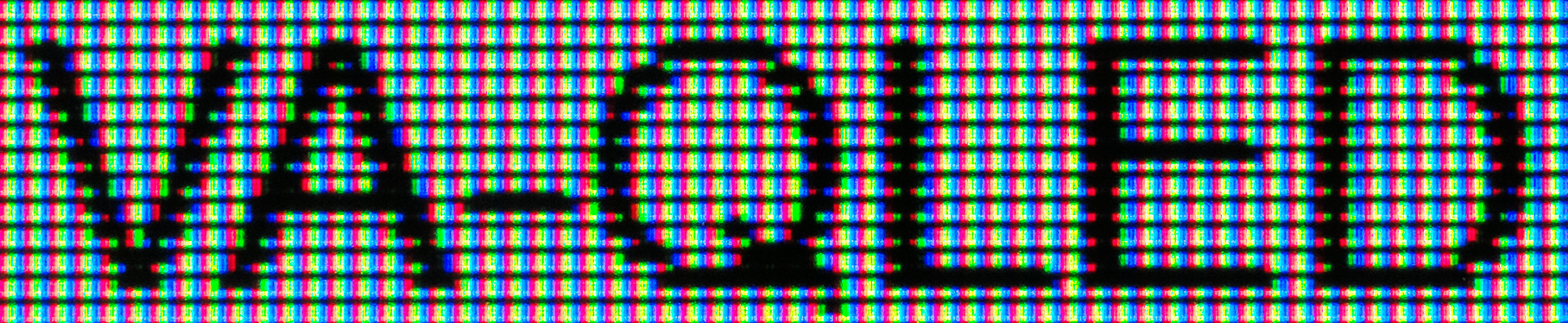
The following contrast-adjusted photo shows the text “VA-QLED” in gray photographed on the said panel. Click-through to the larger version to see it in greater detail. Note how the half-height sup-pixels negatively affect the gray text rending by introducing white dots scattered throughout the text.
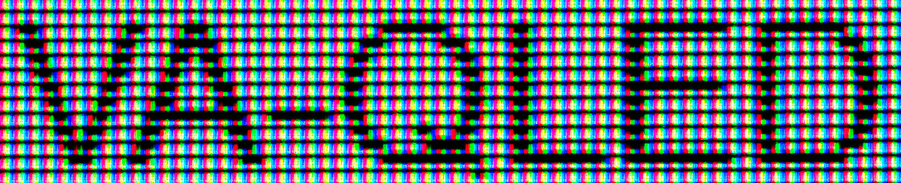
Gray text. Larger photo.
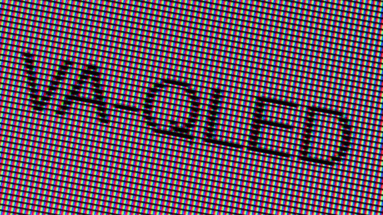
The next photo shows the same as the previous one, but with black text. Here, you can see how the half-height sub-pixels negatively affect the anti-aliased outer-edges of each letter glyph.
Black text. Larger photo.
You can also see a larger version of the feature photo from the top of the article if you prefer a non-color-adjusted version where you can see even more details.
You can change the TrueType font smoothing and anti-aliasing settings in Windows all you want. You won’t find a setting that works well with this type of display panel.
How you perceive this display panel design-decision depends on your eye-sight and how you perceive the world. When I look at a sentence and not individual letters, I see the white quantum sub-pixel as several white lines striking through the text. My significant other has somewhat worse eyesight than me and claims to not notice it as much.
You can read up on and study a ton of detailed technical reviews of this monitor model and display panel type. It’s been on the market since late 2016. However, you won’t find any acknowledgment of the text rendering issue I’ve mentioned here. It’s present throughout the Windows 10 user-interface with the default settings and even Google Search Result Pages are badly affected by it. You can find some mentions of it in some of the deeper corners of places like Reddit, though.
This is the real point I want to drive home with this article. Choosing a monitor is a way more complicated than I first realized and I don’t believe most people will have any idea what monitor to get. There are too many technical metrics to compare and thee technical specifications alone doen’t mean much when the display doesn’t do a decent job at the basics like displaying text on the display.