As a web developer, you may be familiar with the prefer-color-scheme Cascading Style Sheet (CSS) media query. It allows web developers to create separate stylesheets for light and dark color schemas. Web browsers apply one of these color schemes usually following the operating system’s color scheme preference.
Samsung Internet is the default web browser on devices from the world’s largest smartphone manufacturer and the third most popular mobile browser after Google Chrome and Apple Safari. Unlike the other two, it doesn’t support the standard prefer-color-scheme CSS media query. However, it does have its own take on dark mode called “night mode”, however. In night mode, introduced in Samsung Internet version 6.2, the browser applies a set of color filters to webpages, bitmap images, and scalable vector graphics (SVG).
Samsung has not published any information on how night mode works in its browser. This article is based on an analysis of the source code of Samsung Internet version 11. It may not be completely accurate because the relevant code is quite complex and difficult to follow. In this article, I’ll discuss how night mode works for different types of content and what issues it can cause.
Please disable night/dark and high-contrast mode in your web browser before reading this article. This article will discuss Samsung Internet’s color filters in detail and the illustrations may be rendered incorrectly when night mode is enabled.
The following illustration shows a side-by-side comparison of how colors are rendered in the default day mode, in night mode, and an SVG image rendered in night mode. Notice how the colors in the SVG version are considerably brighter instead of darker as one would expect.
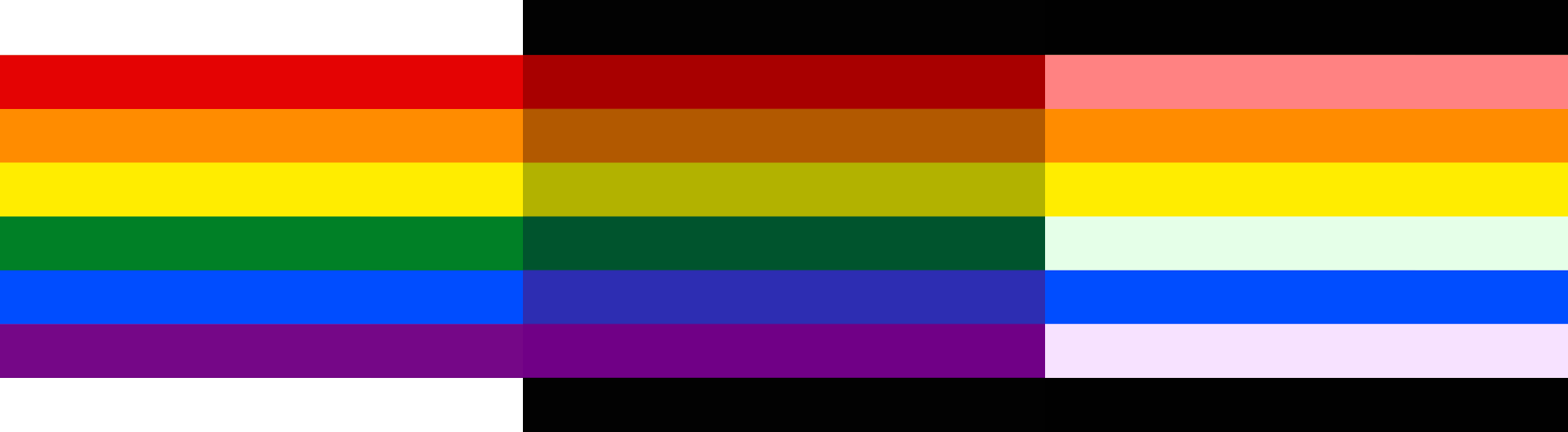
From the left: bitmap image in day colors, the same image in night colors, and the same image as an SVG in night colors.
The color filters are applied just before rendering. The original colors remain in APIs like getComputedStyle; setting Samsung Internet apart from Microsoft Edge handling of high-contrast mode. This also makes it difficult to detect when the browser is interfering with the original page design.
HTML content
Night mode will apply color filters to either darken colors or invert their luminance. Different color filters are applied to different types of HTML elements. The color filter is applied using the following process:
An element’s colors are converted from red, green, and blue (RGB) colors to luminance, blue chroma, red chroma (Y′CbCr) color space (using a standard ITU-R BT.601 conversion). RGB is the most common color space used for digital media and Y′CbCr is normally used for film and television. Y′CbCr has the advantage that the luminance (Y) is separated into its own channel instead of being encoded as a component of the color value. When a color’s luminance is below 85 %, the following filter is applied:
m = invert ? 1 - y : y
y = min_y + (m * (max_y - min_y))
The three variables (invert, min_y, and max_y) are set dependent on which element is being color adjusted. These variables constrain the luminance to a given range. The following table contains the allowed contrast ranges for different elements, and it is copied from Samsung Internet version 11. A luminance closer to 1 produce brighter colors (more light) and numbers closer to 0 produce darker colors (less light). Invert inverts the luminance.
| Component | Min Y | Max Y | Invert | Description |
|---|---|---|---|---|
ROOT_BACKGROUND |
0,03 | 0,08 | No | html element background |
BACKGROUND |
0,03 | 0,12 | any CSS background |
|
BUTTON_BACKGROUND |
0,15 | 0,29 | button background |
|
TEXTFIELD_BACKGROUND |
textarea and input background |
|||
MENULIST_BACKGROUND |
select drop-down background |
|||
MENULIST_BUTTON_BACKGROUND |
select background |
|||
MENULIST_BUTTON_ARROW |
0,20 | 0,70 | Yes | select background |
GRADIENT_FILL |
0,02 | 0,12 | No | css gradient colors |
BORDER |
0,27 | 0,33 | css borders |
|
OUTLINE |
0,14 | 0,20 | focus outlines |
|
BOX_SHADOW |
0,28 | 0,33 | css box-shadow |
|
SVG_PAINT |
0,30 | 0,30 | svg images |
|
TEXT |
0,29 | 1,00 | Yes | text content |
CURSOR |
input cursors |
|||
IMAGE |
0,70 | 0,70 | No | image |
BORDER_IMAGE |
0,50 | 0,50 | image borders |
This luminance filter produces the effect seen in the middle section of the above illustration comparing three renderings of a rainbow flag.
The luminance ranges defined in the above table may seem arbitrary. Because they clearly are. There is no reason why night mode should use these particular ranges or why it doesn’t use the same luminance adjustment to the entire page. Using the same luminance adjustment to the whole page would produce more predictable results.
The color changes can produce okay or strange result depending on the original color scheme. Vox.com’s black on bright yellow brand color becomes white on a dirty brown and CNN.com’s white on red becomes black on light salmon pink.
Samsung Internet uses the same implementation, but with different luminance ranges, to implement its high-contrast mode. High-contrast modes is a whole subject onto itself and I won’t tackle it in this article.
Bitmap images
Samsung Internet has an image classifier that tries to determine whether to invert the lightness of photos. The classifier decides that images that are photo-realistic (has mostly colored pixels), has 40+ % white pixels, or has a 10+ % of high lightness pixels shouldn’t be inverted. This would mean that black icons with transparent backgrounds should be inverted while a photo of a forest would not. The following illustration shows the same black-icon against a white background in day mode and night mode. You can see that the icon isn’t being inverted.
A side-by-side comparison of the Coil.com logo set against a white background in day mode and night mode.
I haven’t been able to identify any images that get inverted lightness even when not doing so causes detrimental effects to contrast ratios. Night mode can hurt the usability and accessibility of webpages that depend on dark icons on white backgrounds.
There aren’t any good workaround that web developers can use to correct this situation. Samsung Internet doesn’t support the prefer-color-scheme CSS media query nor does it have an API that can be used to detect night mode adjustments. The only fixes involve modifying the image and making sure there’s a white border or that the image would stand out against any background. This isn’t always desirable, however.
I’ll go through the lightness inversion process anyway as it will be coming up again in the next section. Colors are converted from RGB to hue, saturation, and lightness (HSL) color space. Note that lightness isn’t the same thing as Y′CbCr’s luminance component. The lightness is then inverted (L = 1.0 - L) resulting in darker colors becoming lighter and lighter colors becoming darker. This results in black becoming white and vice-versa, however. To restore white and black colors, a complicated contrast-adjustment is used. The effect is approximately the same as blending the color with up to 20 % black or white, depending on the distance from the center of the color’s lightness.
To clarify: the filtering process described in the previous section doesn’t appear to be used. Instead, bitmap images have their brightness uniformly reduced by about 30 %. It’s understandable as inverting the lightness channel of a portrait photo could produce … disastrous results.
SVG images
Here’s a quick refresher on SVG images before we dig into this topic: SVG images are Extensible Markup Languag (XML) documents with different shapes (like rectangles, circles, etc.) and paths described as positioned objects with styling applied to them. Unlike a bitmap image, the individual objects the image consists of remains. You can target and animate or change the color of different parts of an SVG image.
The same color filtering that is used on bitmap images should have been used for SVG images. That’s what they appear to have done as well. However, they didn’t abandon the idea of the HSL lightness inversion for SVG images. I’ll let these examples of day and night renderings of some SVG images speak for themselves:

Let’s first look at why some white areas are made black while others remain white. Here’s some pseudo-code where I’ve attempted to summarize the logic behind which SVG objects are lightness inverted and which aren’t:
function IsBackgroundSVG(shape) {
  return (shape == "rect" ||
          shape == "ellipse")
}

IsForegroundSVG(shape_name) {
  return (shape == "path")
}

LightnessInvertSVGColor(shape_name) {
  if (IsBackgroundSVG(shape_name))
  {  return !IsColorDark(color) }
  else if (IsForegroundSVG(shape_name))
  { return !IsColorWhite(color) }
}
Any object that is either a rectangle or an ellipse object (somehow not including squares and circles) are background objects. Any object that is a path object is a foreground object. There is, of course, no such distinction between what is a foreground and what is a background object in the SVG specification.
This is a completely arbitrary distinction made by Samsung Internet. You can, of course, have rectangles and squares in the foreground and paths in the background. The only way to tell if an object is in the background or foreground is to look at its position on the Z-axis. The distinction shouldn’t matter anyway, though.
The white circle in the syndication feed icon (top left in the above illustration) is an ellipse object — a background object by Samsung’s definition — and it’s not a dark color. The object gets inverted which turning the circle black. The other white objects in the same image are white paths. Paths are, by Samsung’s definition, are foreground objects and shouldn’t be inverted when the have a light color.
All the pastel colors are the result of the HSL lightness inversion and blending described in the previous section. The orange, yellow, and blue colors in the rainbow remain unchanged (their lightness is ≈50 %) whereas the others end up as pastel colors. Once you see these terrible results, it becomes clear why this filter isn’t used on bitmap images. However, it does leave the question: why is it used on SVG images?
This section shouldn’t make sense to you. It’s complete nonsense. I don’t know why Samsung went with this weird color filter. I can make an educated guess that Samsung tried to fix the contrast issue that I described in the previous section. SVG images are frequently used for icons and other UI elements. However, it’s also frequently used for illustration and the implementation creates its own set of contrast issues.
As a web developer, you can convert your ellipses and rectangles into paths or vice versa to avoid having objects inverted. You can also choose colors with an HSL lightness closer to 50 % to minimize the effect. Ultimately, this is something Samsung needs to fix in its web browser.
Videos and canvas
These page element’s aren’t color filtered. It would presumably be too processor intensive and costly in terms of device battery life.
Conclusions
For end-users: Dark mode is cool and all. Samsung’s automatic-dark-mode as applied-to-any-design breaks some webpages, reduces contrast, and hurts accessibility. Maybe turn off night mode on Samsung Internet. At least for now.
For web developers: I’d not normally recommend this. However, there’s no way you can detect the use of night mode and deploy any countermeasures. It breaks fundamental assumptions about color on the web platform. if you rely heavily on SVG or have dark images with transparent background on white backgrounds; you can detect SamsungBrowser in the User-Agent and encourage people to switch to another web browser.
For Samsung Internet developers: Please rethink your night mode feature. You can’t arbitrarily invert some page elements and not others. Maybe add support for prefer-color-scheme instead?.